Left-handed calligraphy: a few thoughts
First up, I am a right-hander. So the following is not advice. Instead, I've done my best to analyse a left-handed approach to Western calligraphy by turning myself into a left-hander for a few hours, in which state I learnt a few things.
Fact: most resources, tools and expectations are shaped for right-handers, and this means that left-handed calligraphy does present difficulties. These difficulties are rarely visible to righties, and even more rarely understood.
Yet many successful calligraphers are left-handed. I was taught a course in italics by one of the best-known today, Gaynor Goffe. Others are linked below.
(Scroll to the bottom of the page for left-handed shops in the US and UK.)
Some left-handed calligraphers online
Gaynor Goffe (well-known, UK-based expert, author and teacher, specialising in italics; as of March 2021 I don't know whether she is still running her calligraphy correspondence course but you could try contacting her via the linked website)
John Decollibus (well-known, US-based expert and teacher; linked video explains his background and, from 6.30, lovely footage using a pressure nib; see also his brief outline of approaches and this IAMPETH interview – warning, poor audio)
Klahr (originally self-taught; various styles including gothic/blackletter and italic; linked video is an interview and examples of how he writes at 90 degrees using right-handed dip-pens)
Giorgio, aka @bad_calligraphy (Italian calligrapher in copperplate; links to an interview and his Instagram account)
......................................
Sunshine and Stationery (US; beginners' modern brush calligraphy; linked video, first in a series of four, shows various approaches, tips and tricks)
Missy Briggs (US; beginners' modern brush calligraphy; linked video shows three approaches and her preferred set-up)
Elisa Anne
(US; beginners modern calligraphy; linked video, the first in a
promised series, gives some tips and tricks). Elisa Anne also
guest-writes a helpful beginners' page here.
Maria Vanessa Tolentino (US; beginners' modern brush calligraphy; linked video briefly demonstrates some basic brush-pen strokes)
What do left-handed calligraphers do?
The most common recommendation is to find a comfortable way to change the angle between hand, writing line and nib-tip.
Adjusting a combination of the three angles between hand, writing-line and nib-tip 'undoes' the 90-degree-clockwise rotation that left-handedness introduces and re-aligns your writing set-up so it's possible to form calligraphic letters the same way a right-hander does.
There are various ways this can be done, depending on your tools, the script, how you've learned to write already, and where your hand usually lies in relation to the line.
The elements that can be adjusted are:
- rotate paper (including the writing-line) in relation to nib
- rotate wrist and hand in relation to writing line (with caution, and only a little, so as not to cause injury)
- rotate nib in relation to hand (by adjusting the angle of your grip on the pen or by using, for example, a crooked pen-holder)
- 'rotate' nib-tip in relation to writing-line (by using a slant-cut, left-handed nib or quill)
It may seem extreme to alter your writing position just for calligraphy. But it's quite common for any calligrapher, including right-handers, to do so. It could be easier than you think; calligraphy is a bit like drawing, and doesn't have to be done with the same physical memory and brain training as regular handwriting.
If you're an over-writer ('hook' method), you could
- rotate the paper anticlockwise,
- point the nib down the page towards the bottom right corner and
- reverse all the letter-strokes – ie start at the bottom of each letter and work upwards.
The pen angle will be correct, but you will need to get used to reversing the direction of each element of each stroke, which, particularly in rapid, flourished, and cursive scripts, might tend to give your writing a different aspect from that of a right-hander. That could be a good thing. If you are using a dip-nib, you may need to limit the quantity of ink you put on the nib so it doesn't fall off onto your work. But with a good reservoir on the nib it could be done.
If you're an under-writer, and/or you move your hand over your writing as you go, you might try
- re-angling your wrist A LITTLE anticlockwise to bring your hand further under the line, and
- rotating the paper anti-clockwise, and
- using a left-handed nib cut on a slant so it has an acute-angled, pointy right-hand corner.
For everyone, including right-handers, it's a good idea also to keep the pen pointing somewhat 'into' the paper, not angling up it. Your hand should barely touch. This might be hard to start with. But holding the pen closer to vertical helps develop fine control and a light touch, helps steadiness of ink flow and crispness of characters, and also helps you keep your hand off what you're writing.
Right-handed bias in Western calligraphy: the mechanics
The basic set-up with calligraphy in the Western world is this: you draw a broad, inked nib end over the page so it leaves behind a trail of ink that comes out variously thick and thin as the nib changes direction.
The nib is flexible and slit, and it is kept pointing upwards and to the left so that its thinnest lines run bottom left to top right (slanting upwards as you read forward), and its thick lines run top left to bottom right (slanting downwards).
My diagram for right-handers shows this set-up pretty clearly:
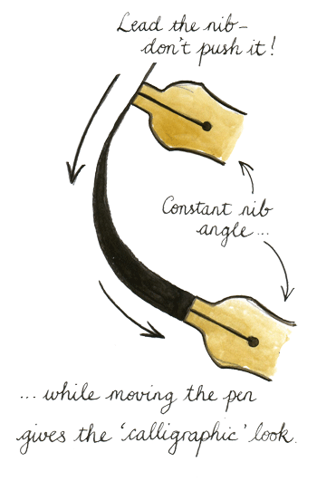
Even formal Uncial, for which the nib-end is held very nearly horizontal, and Rustic Caps, for which it's held close to vertical, conform to this basic alignment. This is essentially a function of the tools used by a right-handed majority, because it feels comfortable and natural for a right-hander to hold a quill pen at roughly forty-five degrees from the horizontal.
[Side-note: the ideal quill pens for right-handers are made from feathers dropped from the LEFT wing of the bird, because the curve is more comfortable to the hand. If you're a left-hander, look for feathers from the RIGHT wing. Bonus: as all geese have two wings but left-handed calligraphers are rarer than right-handed, left-handers have a bigger choice of ideal feathers.]
In addition to holding the pen at roughly 45 degrees, the right-hander pulls the hand across the page and body from left to right, drawing the nib likewise across the page from left to right, and bringing ink smoothly with it.
A quill pen cannot be pushed easily without catching, bending and sputtering. In the same way, a metal nib made to imitate a quill pen tends to dig into the paper when pushed, resulting in spatters and blobs. Equally, a chisel-ended brush does not push well. This is why letterforms based on a circle are formed using two strokes, so the nib is never pushed.
In Arabic, Farsi and Turkish calligraphy, more forgiving reed pens are used on polished paper so that right-handers can write from right to left (the opposite of Western calligraphy) without the nib catching on the paper. Reed pens don't hold ink the same way as quills or metal nibs, though, and result in a different appearance in the resulting calligraphy.
Fountain pen nibs designed for handwriting, rather than for traditional calligraphy, are specially made with a rounded, ball-like shape at the end of the nib so that it can be pushed as well as pulled. This way, round letters can be written in one stroke, and fluent movement of the pen maintained for speedy legible writing. Ball-point pens are likewise designed to move in any direction smoothly. But these form monolines without the pronounced thick-and-thin aspect of traditional calligraphic work.
The left-hander's problem
When you hold a calligraphy pen in your left hand in a natural, comfortable position to write left-to-right, you end up:
- pushing the pen instead of pulling it for most strokes,
- reversing the usual thicks and thins, and
- moving your hand across the words you have already written.
Right-handers can duplicate this problem for themselves by writing back-to-front (mirror-writing) on tracing paper and then turning it over (see below) or simply having a go with their left hand.
1. When it comes to the push ...
First difficulty: left-handed calligraphers undertaking to write standard Western scripts with their hand in a natural, comfortable position find themselves pushing the pen across the page from left to right, instead of pulling it.
As noted above, Western broad-edged pens object to this; the corners tend to catch, paper fibres may snag, the ink flow sometimes ceases or blots, it can be sputtery and scratchy and plain disagreeable.
2. Inside-out and back-to-front
Second: suppose, to correct the problem described above, you decided to pull the nib towards your hand (right to left) for each stroke?
As a left-handed calligrapher, the most comfortable natural writing position is to hold the pen with its nib pointing towards the right-hand-side or top right corner of the page. If you now pull the nib towards you to form a letter, you'll find that the alignment of the nib-end has changed. The thick/thin pattern of the strokes has become reversed.
When a left-handed writer holds a broad-edged nib in a natural writing position, the thin line of the nib runs top left to bottom right (making the thin lines slant _downwards_ as you read forwards), while the thick line runs top right to bottom left. It's all been rotated 90 degrees clockwise.
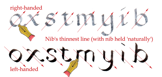
This is significant because it means that in forming any diagonal or curved shape from this position, the thicks and thins of historical, traditional, right-handed alphabet forms will no longer be in the same places as they would in the 'normal' letterforms, assuming the calligrapher is holding the pen in a natural, comfortable position.
So ... the little 'starting lines' that form serifs go backwards, the diagonals are reversed in weight, the round 'o' shapes look unfamiliar and strangely unbalanced, etc.
3. Smearing! Invisibility! Argh!
Third: the left-handed calligrapher's writing hand, if held 'naturally', would follow the pen across the words already written. As the ink is wet, the following hand smears it and spoils the work. This leads to potentially intense disappointment and frustration, because one can't write steadily without smearing the letters just written.
In pencil or ballpoint, or when using an alcohol-based brush pen, this is less of an issue than with calligraphy ink, which can take a long time to dry.
Furthermore, one's writing hand obscures what one's already written, which can make it hard to judge details of spacing, balance and other visual effects that the calligrapher usually determines in the course of writing.
'Naturally left-handed' scripts (copperplate et al.)
In principle, left-handers are at an advantage for the highly shaded flexible-nib scripts like copperplate, Spencerian, etc, because these require a steep nib-angle towards the top right corner of the paper.
In practice, left-handers report that their experience varies. Some find it easier, some harder.
Your natural liking for and interest in a script will take you further than the handedness you're born with: if you love Gothic and hate Copperplate, you'll probably come to write better Gothic, even if as a lefthander you're 'supposed to be' naturally advantaged for Copperplate.
After all, it has mostly been right-handers who've written Copperplate and spencerian styles of scripts, where they're 'supposed to be' disadvantaged.
One thing is fairly sure, if you are interested in flex nibs: it's likely not worth your while buying the rarer, more expensive 'elbow' nibs for left-handed calligraphy. They don't seem to perform quite so well as standard Copperplate nibs anyway, they're more expensive, and were only designed to make it easier for right-handers to get the nib round to the correct angle. That's something you won't have difficulty with, so stick with original (good quality) copperplate nibs.
A word (or several) on the subversion of (right-handed) tradition
There is a serious lack of resources out there for left-handed calligraphers, as I discovered when putting this page together, and (I'm sorry to say) a serious lack of understanding from right-handed teachers and fellow calligraphers.
As a right-hander, I don't have the experience of tackling an art form that is set up for a world that is frustratingly out of step with my basic physical co-ordination and instinct.
So I have tried to duplicate the experience by turning things backwards for myself and having a go. After all, what if the majority of Western calligraphers had all been left-handed instead of right-handed ...? What if, as a race, we humans were 90% left-handers, and right-handers were the minority?
In that case, it would be easier to draw the pen from right to left across the page, so it would mean that we would all be writing lines of text from right to left, and forming our letters from right to left – like writers do now in the Arabic-speaking world.
Which is very possible. (Since the majority of the Arabic-speaking world is just as right-handed as everywhere else, it's not the whole answer. But let's run with it a moment.)
So, as a left-hander, why not write right-to-left? It's a little more radical than the adaptive solutions above, but it's possible for left-handers to cultive forms of mirror-calligraphy, like Leonardo da Vinci's notes but more aesthetically pleasing, which run from right to left across the page.
If anyone else wants to read it, they can use a mirror, or learn to read backwards (which is not terribly difficult). There are already grand traditions of mirror-calligraphy in the Arab world which (so far as I know) usually feature script flowing both ways on the same page as part of a monogram-type design. Arabic lends itself to stylised forms in this way. There is no reason why Western calligraphy shouldn't go its own way with a mirror-uncial, mirror-italic, mirror-gothic, etc. I would LOVE to see a fully bound, illuminated mirror-written and mirror-illuminated book, which opens 'the wrong way round'. Why not? Alice Through the Looking Glass would be a good text to start with.
I am feeling enthusiastic and I would totally make you an example but I can't write calligraphy with my left hand :(
But then ... as noted above, it's not necessarily true that if we were mostly left-handed we would all be writing from right to left. Because the majority of Arabic writers are right-handed, and still, they write right-to-left. Like everyone else in the world, they were using liquid ink to write with before the twentieth century, and they were writing it with broad-edged nibs too. And Arabic speakers (and Farsi and Turkish) have been doing this for more than a thousand years, and in doing so have created some of the most beautiful calligraphic books known to humankind.
We're talking about at least three major civilizations famous for astounding calligraphy, in which the vast majority of writers started life in the exact same position that all Western left-handed calligraphers find themselves in: pushing a dip-nib across a page with the hand following after.
(In case you are wondering about Hebrew, which is also written and read right-to-left, it differs from Arabic letters in two key ways: the letters do not join with each other in Hebrew, and each letter is individually formed using strokes from left to right – so it actually uses a 'pull' method for its calligraphic effect. After writing a letter using left-to-right strokes, you move to the left to write the next letter in the word.)
So what I would like to know is: now that Western civilization is a little more relaxed about people being left-handed and doing things left-handedly, why shouldn't left-handed calligraphers develop new sets of new scripts that are _specifically designed_ to be written in a push-the-pen, thin-lines-running-top-left-to-bottom-right way – a set of specifically left-handed Western scripts, which go left-to-right so everyone can read them easily? (And which – O justice! – would be rather difficult for right-handed calligraphers to write well?)
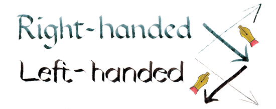
Of course, against this, there is love and respect and admiration for what we already have. I am not arguing that left-handers should turn away from the existing scripts that have been evolved in a right-handed context. That isn't the point. The point is the potential and opportunity, using the tools we have in a different way, to develop new forms of beautiful writing in the form of specialised left-handed calligraphy.
The letterforms making up such left-handed calligraphic scripts would have to be consciously re-evolved _as though Western civilisation had always been majority left-handed_. In other words, a back-to-front version of what actually happened in the Arabic-speaking world.
Think about it. If everyone in school in Europe for the past fifteen hundred years had had to learn scripts in which the thin lines angle downwards ahead instead of upwards, if every Biblical scribe and copyist of the fourteenth century had been working left-handed as they laboriously traced out Gothic letterforms, if the exclusively left-handed Papal Curia had developed smart cursives running left-to-right, what would traditional calligraphy look like today?
Imagining a left-handed calligraphic universe
I've started the beginning of a right-hander's answer which I hope others will take up and develop further at some point.
I made myself artificially into a left-handed calligrapher, by writing with my right hand in mirror-image (back to front) on tracing paper. The translucency of the paper meant I could turn it over and see how it would have looked if I'd been writing left-handed. This taught me a lot about the way calligraphic alphabets and techniques have evolved as a function of predominantly right-handers using mostly quill pens for fifteen hundred years or so. (It also made me really conscious of how spacing is a function of the direction one writes in, and helped me notice that my counters in 'o's and such are really uneven.)
Let me emphasise: I wasn't trying to write traditional right-handed calligraphy the other way round. I wanted to start to imagine what a genuinely left-handed Western calligraphy could look like. It's different. I think it has potential.
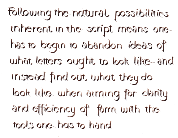
Some basic issues I'd point out for attention are:
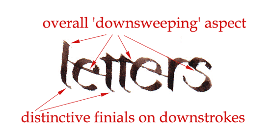
1. As noted above, Western nibs don't work well being pushed. My answer in the script pictured here was to pull the nib left-to-right for each individual stroke (and sometimes each letter) but to form each word right-to-left. If you think that's mad, consider that Hebrew is still written that way, and Chinese is traditionally written starting in the top right corner of each page such that each character is formed with left-to-right strokes, forming part of a sequence of characters that runs vertically down the page to form columns that in turn march right-to-left across the page. So nothing is set in stone.
Another answer might be to use reed pens (and meanwhile find some local European equivalent that works better than a quill pen would have done for a left-hander ... if we'd all started out by pushing the pen we would never have decided that a split quill was a good writing implement.)
2. The thicks and thins fall in different places within a letterform. One of the big 'things' in calligraphy is Proportions of the Letterforms, making sure the counter:line ratio is good, keeping the visual impact of each letter within a certain aesthetic margin by tweaking its height-to-width and being very careful about where the thins and thicks fall. So the new left-handed letterforms will have to be re-evolved to look nice in their own way. You can see that they look a little like shadow-writing, and the hairlines and aspect are downwards-facing. It gives the writing necessarily a different flavour.
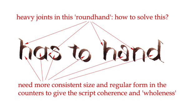
3. If you're pushing the pen, the way letters join is different from how they join if you're pulling (see above). When you come to think of it, there's no particular reason why letters have to join the way they do except that that's where the pen stroke naturally ends. If, because one's evolving a new kind of alphabet, the last pen stroke ends in a different place from 'normal', then the joining stroke to the next letter is going to be in a different place from 'normal' too. So we would have to get used to some new kinds of liaisons between letters.
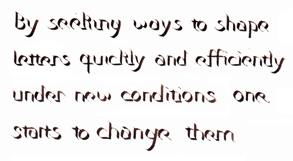
OK it's not the Book of Kells yet. But overall I think this is an exciting possibility. As well as better resources for writing right-handed calligraphy with the left hand, it's perhaps also time to create a new breed of left-handed calligraphy designed for left-handers.
What do you think?
In any case: have fun! Challenge conformism! Make beautiful things!
Left-handed shopping :-)
I don't have any affiliate connection with these retailers. They're just included to be useful.
US: Lefty's the Left Hand Store
Return to homepage