History of calligraphy (and 'calligraphy') in Europe
Let's look first at the history of 'calligraphy' the word. Because the word is, weirdly, only about 400 years old in Europe. It first appears in English sometime between 1590 and 1610 (depending on your source).
(The 1590 source is Peter Bales' The writing schoolemaster, containing a section on 'the key of calygraphie'.)
It's weird because, of course, beautiful, 'calligraphic' manuscripts were being written in the British Isles for many centuries before 1600. The celebrated Lindisfarne Gospels were written around 700 AD as part of an established tradition of insular book-hands, which means that 'the history of calligraphy' (as we think of it) in Britain is by now well over 1,300 years old. That's around the same age as Arabic calligraphy, which started in earnest in the seventh century AD with the Kufic scripts developed for copying the Qur'an.
Looking earlier, to Roman calligraphic efforts, we find monumental capitals (carved in stone) and Latin book hand (very roughly, from the first to fourth centuries AD). Chinese brush calligraphy started a little earlier, with the Han Dynasty, around 206 BC–220 AD – around the same time as formal Greek hands on papyrus scrolls. Before that, Aramaic and Hebrew book hands showed calligraphic qualities with a particular pen-hold for thick-and-thin lines formed using a broad-edged nib. And before that, Egyptian scrolls go back, ooh, another thousand years? (googles) omg: 2,400 BC is what the interwebs say for the earliest Egyptian scrolls. I don't know how calligraphic they were, but I know hieroglyphics were very carefully painted. For all I know, there were more or less calligraphic forms of cuneiform.
Logically, you would think, the history of calligraphy should begin with the earliest scribes who distinguished themselves with very beautiful writing and so were employed by the wealthy and powerful (Church, government, aristocrats) to create legacy manuscripts.
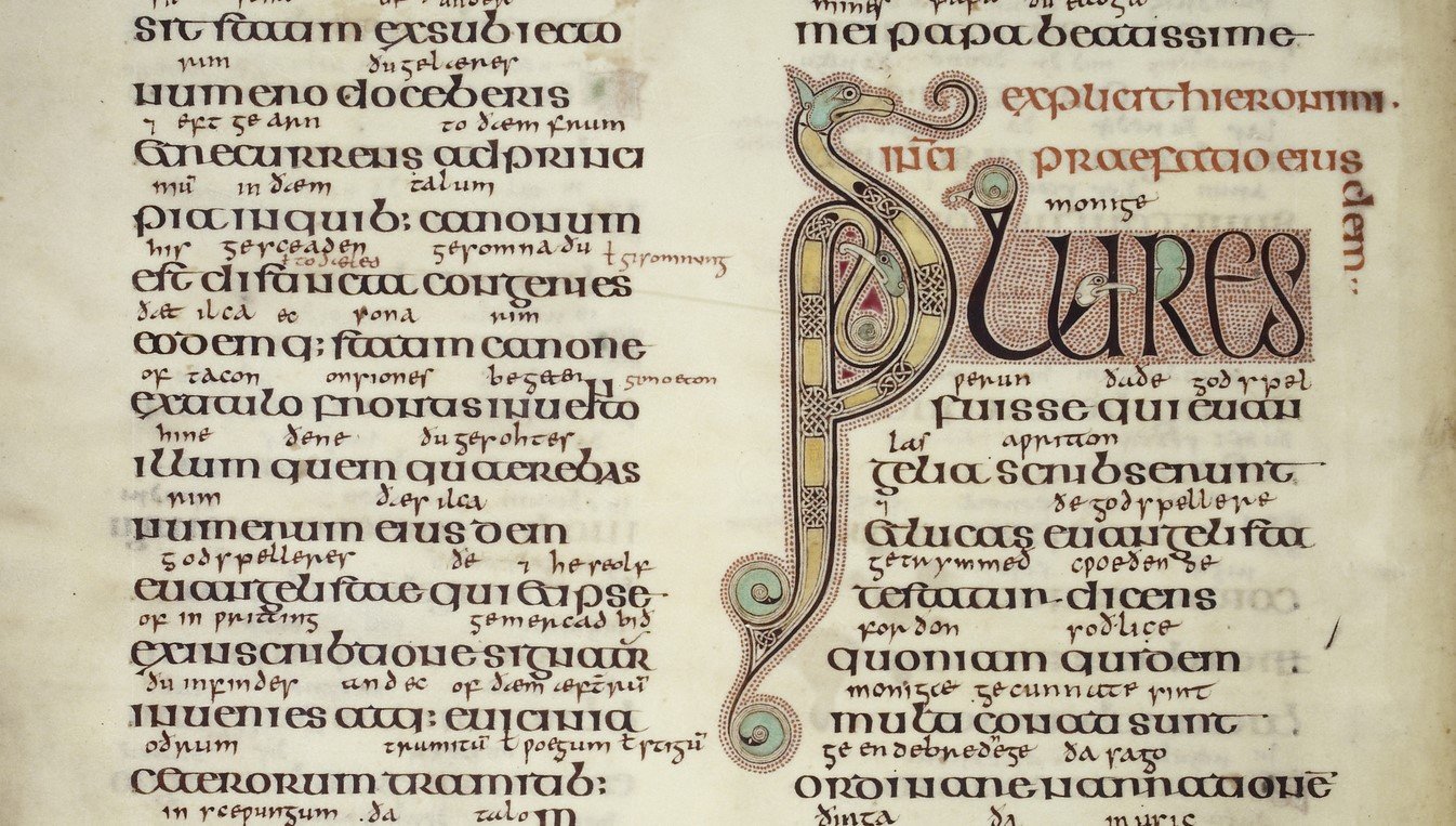
Lindisfarne Gospels, f. 5v (c) British Library. I think we all agree this is calligraphic, yes?
But the word 'calligraphy' was invented much later for a reason.
Contrary to what we are usually led to believe, the history of calligraphy and the history of beautiful writing are, conceptually, two rather different things. For example, palaeographers (experts in ancient handwriting) don't talk about 'the history of calligraphy' when they discuss historic book-hands. Yes, they describe a hand as 'calligraphic' if its writer was making a self-conscious effort to write particularly beautifully. But ask them if it's 'calligraphy' pre-1600 or so and I bet they will wriggle and start talking about historical context.
In fact, until Gutenberg invented printing, there was no such thing as 'handwriting', even – because there was no such thing as 'writing that wasn't done by hand'. There was just 'writing'.
Therefore, no-one would ever have said 'Ah, yes, Brother Cuthbert's writing by hand is very beautiful' any more than they would have said, 'My sister's face on her head is very beautiful.'
Of course, some writing was more beautiful than other writing, and the beautiful writing could be observed and described as being beautiful.
In which case, scribes could charge more for it.
But it still wasn't 'calligraphy'! It was 'beautiful writing'.
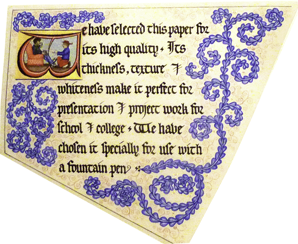
The history of calligraphy is the history of people consciously identifying handwriting as a potential art-form separate and distinct from any other method of shaping writing symbols (woodcut, typography, engraving, skywriting, etc).
The history of beautiful writing is much longer, and is the general history of people shaping writing-symbols by any means for aesthetic effect.
Why was a fancy new Greek word made up in 1600ish for something that already existed and already could be described?
During the long period before the invention of printing, the primary purpose of handwriting was always to preserve and transmit meaning. Previous revolutions in information technology, such as Alcuin's development of Carolingian minuscule for Charlemagne or its reinvention by Bracciolini and Niccoli as Humanistic Script during the Renaissance, merely transferred cultural and educational power from one form of handwriting to another.
For these men, 'calligraphy', if they thought of it, would surely have meant the beauty of efficiency: legibility, clarity, ease of letter formation. They were trying to get away from over-elaborate, over-stylised, near-illegible dinosaurs of scripts such as Merovingian Court hand or gothic textualis prescissa uel sine pedibus.
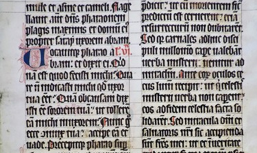
14th-century Dominican lectionary in gothic textualis ('book-grade') prescissa ('cut off') uel sine pedibus ('or footless'), so-called because the minims end flat on the line, which is really hard to do and which shows that the scribe cared a great deal about trending concepts in page-design and not very much about eye health.
However, as printed books became cheap and widespread, the monopoly of handwriting as an information technology was broken. True, typesetting was time-consuming up front. But once printers had set up their plates, they could knock out a lengthy, popular volume in vast numbers hundreds of times faster than scribes could, with comparatively low marginal costs, and often also with greater legibility and fewer errors.
Printing was bigger, better, faster, higher-tech.
The printing revolution ripped most of the political and cultural power inherent in information technology out of handwriting and slammed it into type.
Well before 1600, then, managers of established scriptoria must have been looking at the new print-works down the road and racking their brains for ways to stay afloat. How to compete? How to collaborate? How to sell the characteristics of handwriting as features, not bugs, and how to represent these features as benefits which a customer would pay for?
So the old way of doing it (handwriting) started to be looked at differently – as the more scenic route to meaning, as a way to obtain privately-produced reading-material. The hard labour of copying all books by hand was over, and at the same time an increase in available printed matter was generating a higher demand for literacy among an expanding middle class.
Former scribes had to get out and sell a new idea: 'Buy our beautiful writing which is performed by hand and that is what makes it special'. They did sell it, and so, surely, arose several ideas which we retain to this day about calligraphy:
- it's done by hand – the real thing can't be produced mechanically
- it's technology-light: DIY, the gear fitted to and for the human frame, made from what works and is cheap and is lying around (reeds, goose-feathers, drinks-cans ... yes I have heard about those fancy nib-holders hand-carved at dawn out of solid bricks of compressed unicorn-hoof-trimmings and congealed dew and I think they are very well marketed)
- it requires technical training (note: 'trained' means either 'I'm a professional and you pay me' or 'I myself am affluent, with sufficient leisure to have learned this shit so I can scribble love-notes and sign betting slips')
- its limited distribution potential is a virtue (scarcity value of manuscript copies)
- it offers a physical trace of the author's real and immediate presence – live performance, mark-making, gesture, 'the very page that Shakespeare touched' etc
- it rises above the vulgar appetites of the herd with its unique and distinctive aesthetic, its sublime je ne sais quoi – it's artistic, darling, artistic, I tell you.

Line of practice letters in Bernardino Cataneo's copybook (1545)
History of calligraphy as a professional discipline
Under the new economic pressures, in this new conceptual space, scribes had to find new ways to be relevant and necessary to society by focussing on areas print wasn't good at, such as:
- copies of books for collectors who still had a thing for manuscripts rather than print
- relatively short literary pieces, such as multiple copies of play-parts for actors to learn from, or verse-collections by authors who wished to circulate them only among a few discerning friends
- grand, ornamental one-offs for display or presentation
- significant personal and legal documents: letters, accounts, wills, certificates, invitations
- short fast commercial runs such as news-sheets, posters, ballad-sheets, or other ephemera for which the process of setting type would be too long or too costly
- items it was risky to be caught printing, such as political satire, libel, scandal etc.
- writing lessons for others
- teaching aids for how to write better ... and what an aha moment that one must have been. "Boys, boys! I've got it! ... Get those bastards to print books about how to write!" <loud cheers>
In fact the list of items above is still the list of items produced by calligraphers today in their ongoing role as scribes (apart from the truly politically risky stuff which has moved mostly online).
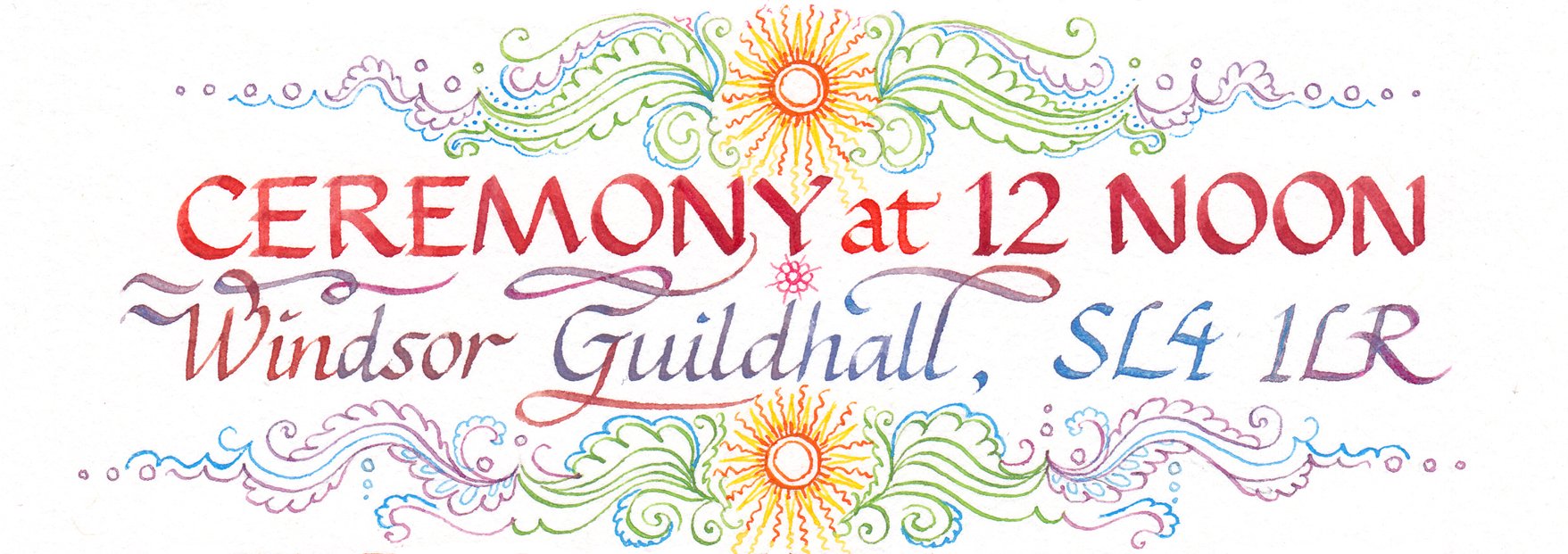
Well before the seventeenth century, handwriting in Europe had largely evolved into a series of cursive scripts because of the the ever-increasing demand for written materials – the same demand that had resulted in Gutenberg's invention. Speed and clarity were of the essence.
Interestingly, while scribing had been either Church-led duty or blue-collar paid work, and in either case deeply un-aristocratic, 'handwriting' was not. 'Handwriting' could be classy (and the class was, increasingly, leisured, or wanted to appear so).
Moreover, people who could already write well suddenly had an audience of people who wanted to be able to write well and (as above) printing offered a way to reach them, and make money doing so.
Lo and behold: from the end of the sixteenth to the mid-eighteenth centuries, writing-masters duly spring up like so many elegant mushrooms to teach the gentle art of handwriting to those who could afford it, their efforts culminating in 1733 with George Bickham's immortal work The Universal Penman.
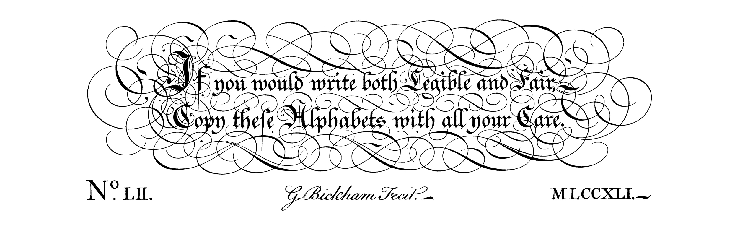
From the frontispiece of George Bickham's Universal Penman (1733).
'Scribal industry' vs 'print industry' vs 'calligraphy'
So there you go.
After thousands of years of effort to make scribing more efficient, those efforts gave birth to the print industry – and, one could argue, some of the leftover skills and habits of mind from the outdated scribal industry gradually cohered into 'the art of handwriting'. Similarly, I suppose, once 'weapon-forging' had evolved into 'the arms industry', we are left with things like 'the art of sword-making' – no longer out of necessity but for ceremonial purpose or pure interest. 'Catching fish' resulted in 'the
fleet-fishing industry', which leaves behind 'the art of fly-tying'. Etc.
And this new way of seeing the elegant, aesthetic, voluntary side of handwriting was eventually awarded a Greek name around 1600, not because beautiful handwriting was especially Greek in origin but because Europeans used Greek and Latin to show, basically, that they were ubercool in a creatively nerdy way and able to talk freely to each other all over Europe (note to self: a classical education was the original iPhone).
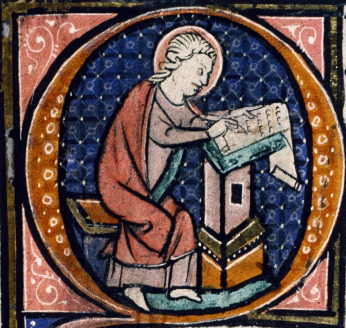
St John as scribe, MS Auct.D.1.17 (c. 1260-1270) (c) Oxford Bodleian Library
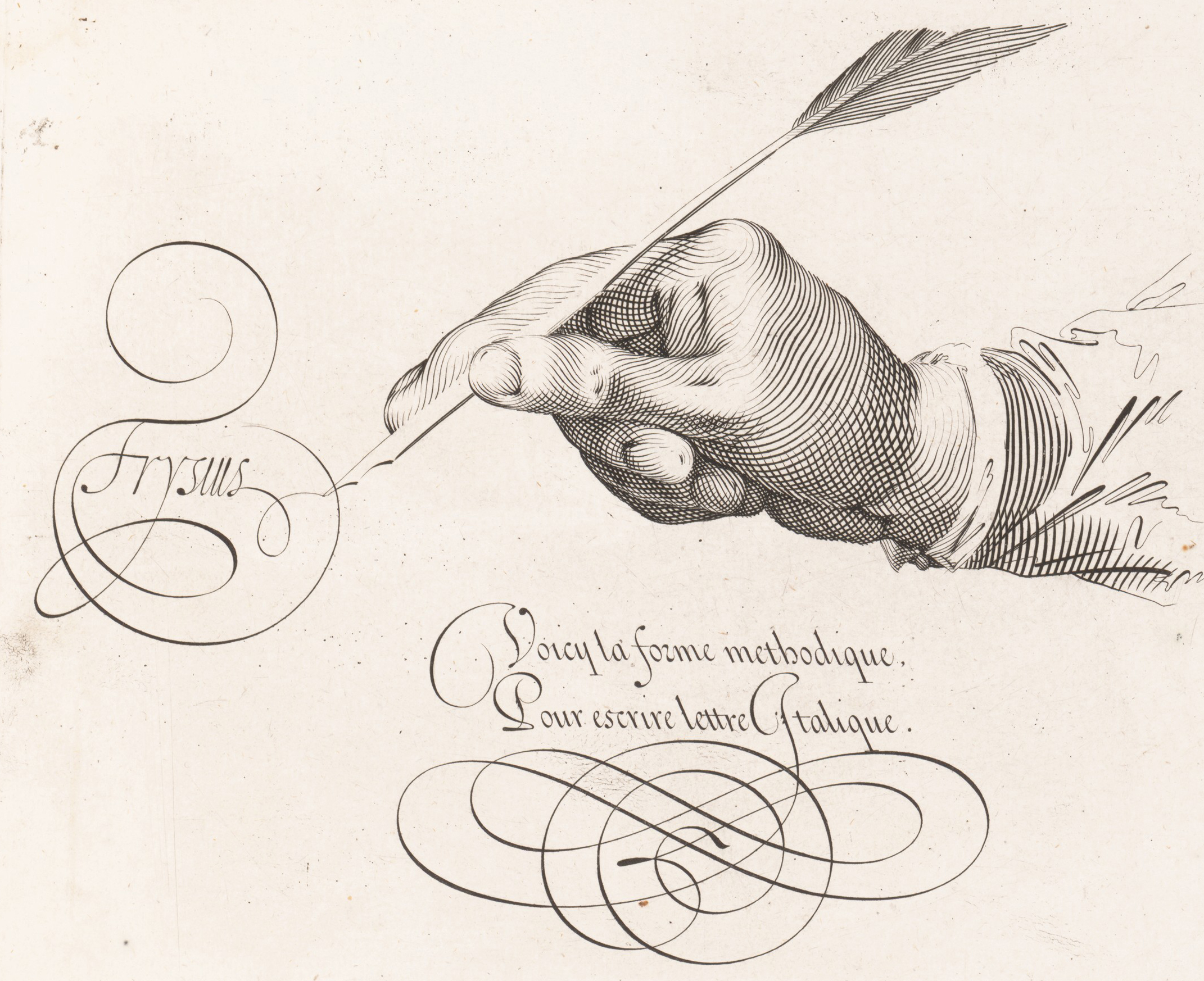
Jan van de Velde, Spieghel der Schryfkonste (1605)
You tell me who looks as though he's having more fun with that goose-feather.
Beautiful handwriting was named 'calligraphy' so that it too could enjoy the cool, slightly nerdy, slightly aloof, scientific-technical-artsy mystique of Greek.
And by this point in the story, around 1600, I'd say the history of 'calligraphy' had become truly distinct from the broader history of 'beautiful writing'. We continue with both histories in parallel.
Changes in handwriting technology
The continuing spread of print and its technological innovations can only have amplified the demands on handwriting to be fast and legible as well as distinctive.
As far as I can tell, this meant generally that the
broad-edged quill was gradually cut narrower with a slanted tip, to
suit faster, more cursive writing.

Eventually the quill gave way to the flexible steel nib, the fountain-pen and finally the Biro ballpoint pen, all likewise aimed at making handwriting easier, faster, clearer and more convenient.
All through this time of upheaval, though, printing and calligraphy had borrowed heavily from each other. English roundhand (originally written with a quill) evolved into the original copperplate (etched in metal to imitate the earlier, handwritten script) followed by copperplate handwriting (using a flexible steel nib, and which resembled copper-plate-printed script) followed by mid-twentieth-century imitations of copperplate handwriting in print by foundries such as Stempel with Hans Bohn's Kuenstler Script, which in turn has inspired a digital version by Adobe, which any moment now will doubtless be precisely reproduced by hand in a Seb Lester video.

Hans Bohn's type version of copperplate handwriting: a font, not a script. (Linotype original.)
The re-imagined history of calligraphy: Edward Johnston
Even while quills were still very much in use, during the Victorian period, we are treated to the remarkable sight of enthusiasts for medieval culture apparently trying to reproduce Gothic script using a pointed pen – a monumentally effortful exercise in self-conscious calligraphy and one which (in my opinion) was pretty much doomed.

Responding to such 'bad medievalism' (I'm wildly skipping over masses of event and culture along the way here) were William Morris And All That, and out of the Arts & Crafts ethos we get Edward Johnston, who single-handedly rediscovers the forgotten broad-edged nib (so the story goes) and, with copious reference to the manuscript evidence and a great deal of his own opinion, puts the history of calligraphy firmly back on the path to righteousness, which turns out for the vast majority to be the path to hobbyism but produces some blisteringly good calligraphers along the way.
On that wave of interest in medievalism and the rehabilitation of 'the Dark Ages' and research into the origins of culture and language, artist-scholars again cultivated an interest in historical handwriting, alongside paleography and philology, as they had during the Renaissance and under Charlemagne, and undertook a disciplined analysis and reconstruction of how the past had preserved and transmitted its thoughts to the present.
But this time, as far as I can see, the purpose was to revive the perceived aesthetic of the handmade quality of handwriting and its historical vibe rather than to bring about a renaissance in the clarity and efficiency of writing technology. The Kelmscott Press was never going to overtake Hoe's six-cylinder rotary press as a medium for popular information.
I love the Pre-Raphs, don't get me wrong, but in the end there's only so much green-gowned wistfulness a girl can take before needing Burne-Jones to pull himself together and nail up a set of spice shelves, stat.
Yeah, I know. I should nail up my own spice shelves.
And Johnston could certainly saw up a bit of woody material if it happened to be a reed:
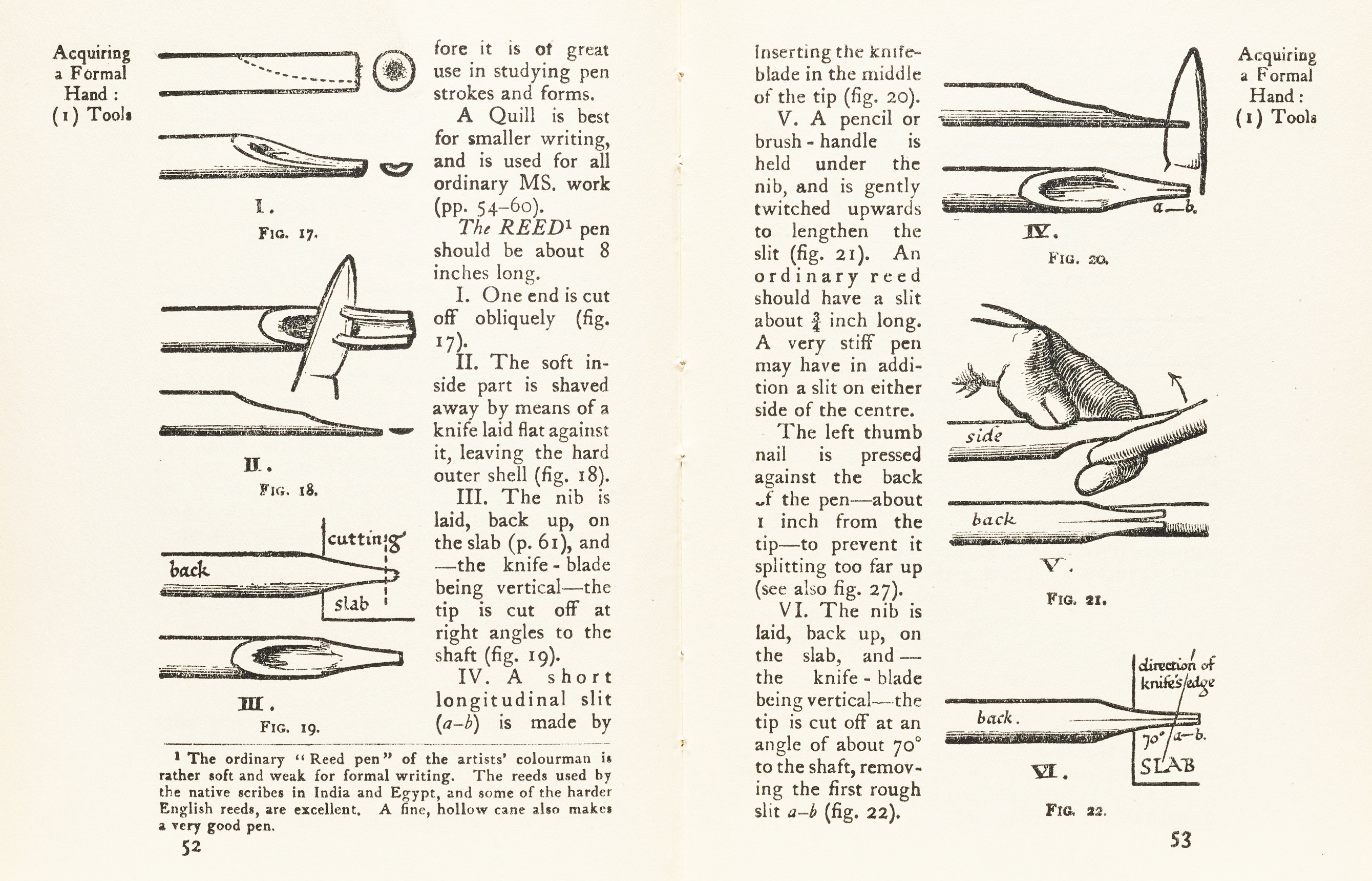
Instructions by Edward Johnston (Writing & Illuminating, & Lettering, 1906) on how to cut a reed into a broad-edged pen with which to write calligraphy.
And to present day
So, remarkably, after all that narrowing and pointing of the quill to facilitate cursive forms, resulting in a durable pointed metal nib, the twentieth century sees the revival of broad-edged-quill handwriting in the pursuit of calligraphy as a rigorous niche discipline, both in England and abroad.
Consequently, there arises another huge interest (I say huge: relatively huge) in historical scripts and manuscripts as authentic source-materials and teaching aids, which continues for calligraphers until now: Heather Child's The Calligrapher's Handbook (1985) remains a core reference text and, most recently, I think, Michelle Brown (a renowned palaeographer) collaborated with Patricia Lovett (a well-known calligrapher) to produce The Historical Source-Book for Scribes.
(I'll do book lists elsewhere on the site. There are just so many books.)
Good calligraphy teachers continue to provide handouts showing historical examples of the script they're teaching, for analysis and study. Good distance-learning calligraphy courses do the same. They do this to try to feed past successful models of handwriting into their students' practice.
During the twentieth century, as previously during its history, calligraphy has continued to overlap and mingle with typography, sign-writing, letter-carving in stone and wood, graffiti, and the fine arts. And, like illustration or ceramics or even architecture – as an applied art, an art with a usefulness – calligraphy remains a little looked down on in Western aesthetic circles as 'not quite the real thing'.
Whatevs.
Seb Lester's logo reproductions pinpoint what I think we mean today by 'calligraphy'. A digital copy or a photocopy or even a mimeograph of a Netflix logo or CocaCola logo remains, still, just a logo – but when someone skilled reproduces it by hand using a traditional nib dipped in ink, we deem that that particular instance of the logo has become calligraphy.
Today, in the history of Western calligraphy, we have a good situation in that there are very many more calligraphers and calligraphy enthusiasts than there have ever been before, and we are very much more connected with each other than calligraphers have previously been.
At the same time, towards the end of the twentieth century we saw extensive losses of the formal training institutions and traditional (read: Johnstonian) methods of learning calligraphy.
And, during the last decade, interestingly, the meaning of the word 'calligraphy' has been steadily drifting away from 'broad-edged-nib, historical hands' and into 'brush-pen-writing in a pointed-pen style'.
We are also witnessing a huge decline in
- handwriting at all as a taught discipline
- capacity for reading words
If you are still reading this, you must be in the tiniest top percentage of people with the capacity to take in writing. Either that or you're my mum: hi, BAM. (It's an acronym and I won't tell you what it stands for except that it contains a hyphen and the last word is Mother.)
You'd think the twenty-first century and Covid-19 would have boosted calligraphy to high heights as 'people look for things to do during lockdown' (That's a thing, right?) But to me it looks as though 'calligraphy', in its wanderings in and out of people's awareness, peaked briefly in 2018 and is now dipping again. Not gonna say nuffing about fickle hobbyists and 'the next scrapbooking craze'. This website has only been around since 2009 and has already seen plenty of dips and rises. Gothic slumps; fraktur climbs; modern calligraphy peaks and falters; italics are like gold funds, always a reassuring hedge :-)
The history of calligraphy, as an interest in forming letters beautifully by hand, is not ending anytime soon.
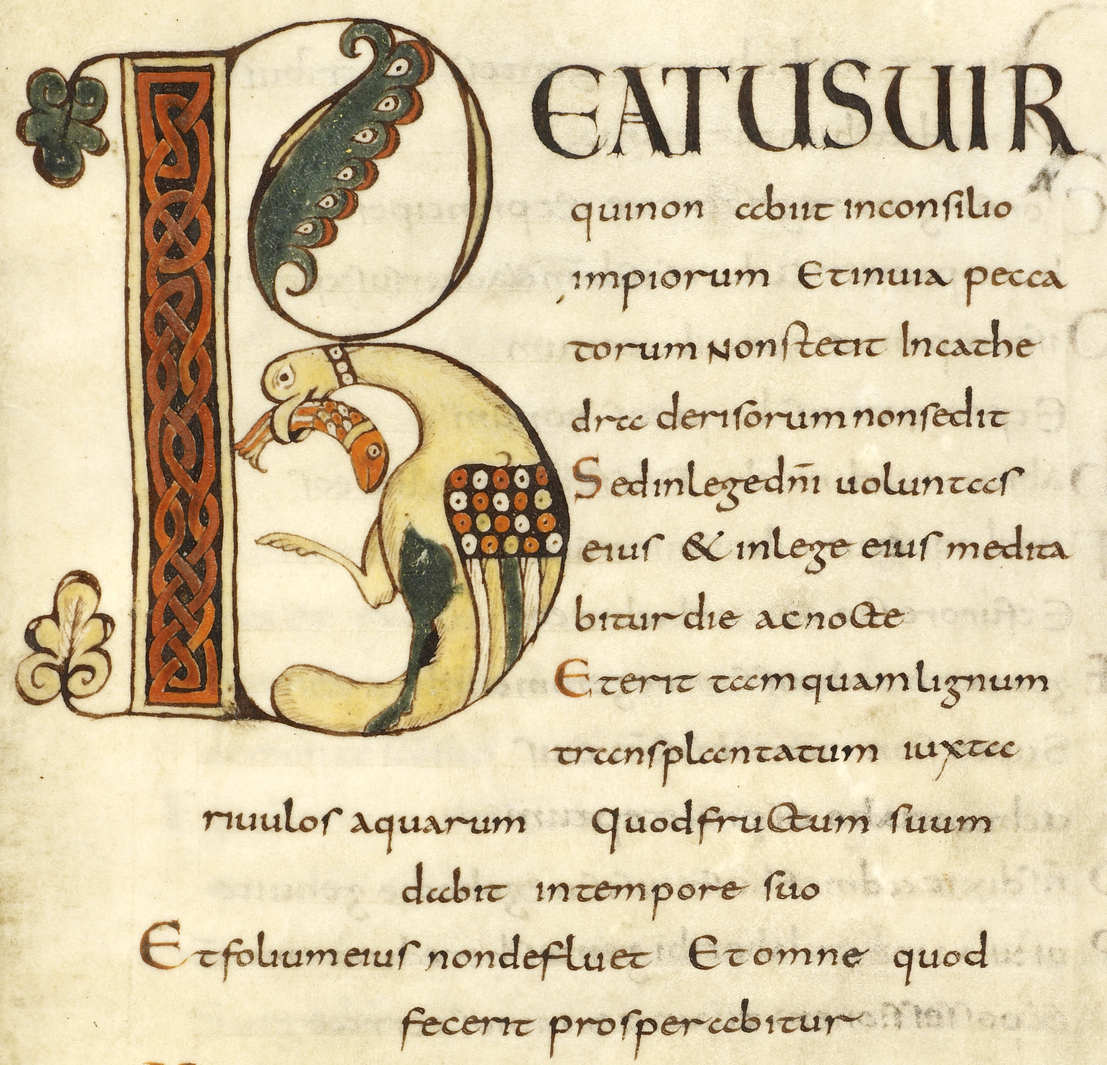
MS BL Harley 2793, f.33, Psalm 1, 'Beatus uir' (9th century, Carolingian) (c) British Library
Personally, I have found that it is indeed useful to know your roots as a calligrapher. When you understand why and how a script is written the way it is, you get better at it, and also can start developing your own distinctive style in response.
None of the above covers the individual histories of the specific scripts commonly referred to as calligraphic: Roman capitals, uncials, half-uncials, roundhands, gothic, italics and all that. I'll cover those on other pages. Eventually.
Thanks for reading. Let me know your thoughts.
Selected references
Anon., 'Martin Billingsley: The Pens Excellencie or the Secretaries Delighte (1618)', from English Handwriting Online 1500–1700: An Online Course, University of Cambridge
Asia Society, 'Chinese Calligraphy' (accessed 20 March 2021)
Leedham-Green, Elisabeth, 'Early Modern Handwriting: An Introduction', from English Handwriting Online 1500–1700: An Online Course, University of Cambridge
'Lady Smatter' (nom de plume), 'In Search of a Good Hand', from Her Reputation for Accomplishment (blog) June 15, 2014 (accessed 18 March 2021): part of a brilliant series investigating the practical and informational challenges of acquiring the skills, including penmanship, considered desirable in a young lady during the Regency period.
O'Hogan, Cillian, 'Ancient Books', British Library online (accessed 20 March 2021)
SF Book Reviews, 'The Evolution of the Book' (accessed 20 March 2021)
