How to write calligraphy
To learn how to write calligraphy, you need to be familiar with the three most basic calligraphy skills described (and illustrated) below.
If you're already happy using a broad-edged nib, you might like my
- Gothic online tutorial (several pages including majuscules)
- Guidelines for italic calligraphy (two pages)
- Roman Rustic Capitals

Calligraphy requires very few special items to start with. Luckily, too, they’re mostly simple and inexpensive:
• A calligraphic writing tool such as a pen or brush
• Ink, or similar
• Paper (or another writing medium)
• A smooth, hard, flat supporting surface
• A seat at a comfortable height
• Optional: a ruler and pencil (for lines to write along)
It’s also an advantage to write your calligraphy on a sloping surface.
Practising vital calligraphy skills
Learning how to write calligraphy in the Western world means learning how to manipulate a ‘thick-and-thin’ effect which pleases the eye with a flowing, regular pattern.
Nearly always in the West, a ‘calligraphy nib’ means one that is broad and flat instead of an ordinary rounded point such as a biro or fountain-pen nib. (Copperplate nibs work differently!)
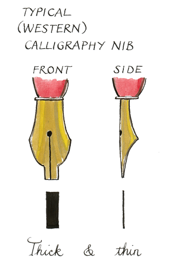
This broad, flat structure means that the nib creates a distinctive ‘thick-and-thin’ effect when it moves over the page, and this effect is what makes calligraphic letters look so nice.
Even if you already know how to write calligraphy, it's worth refreshing these three core skills:
- Keep the pen-angle constant;
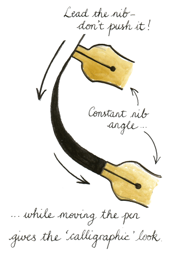
- Lead the nib, don’t push it;
- Make parallel lines and even curves.
Get these right and the rest is just detail, variation and practice. Well ... mostly :-)
How to write calligraphy: the first skill
Hold your pen at an unchanging angle. For most scripts you'll hold the pen so that the tip of the nib points diagonally away from you to the left, at around 30-60 degrees. (The exact angle varies for different scripts - don't worry about this for the moment.)
The nib should not turn as you form lines and curves. It should always point in the same direction, like a compass needle, whatever the pen and your hand are doing. This give regularity to the script. This is the foundation of how to write calligraphic letterforms.
How to write calligraphy: the second skill
Lead the nib gently across the paper, moving it backwards or sideways from the direction it's pointing in. Use little pressure and keep your hand barely touching the paper - try not to lean heavily on your hand, wrist, forearm or elbow.
(If you press too hard on the nib you may damage it and then it won’t work well. If you push the nib 'forwards' away from your hand, it will tend to dig into the paper and sputter or blot, and this spoils the work as well as damaging the nib. Beginners often lean heavily on their arm but this pressure makes the letters look stiff and clumsy, and after a while it hurts, too.)
How to write calligraphy: the third skill
Draw vertical, horizontal or diagonal lines parallel with each other. If you want to learn how to write calligraphy of different types, all three will be needed! (For example, italic calligraphy is built with lines that slope away upwards to the right but ordinary Roman letters are built on perfectly vertical, straight-up-and-down lines.)
THESE ARE SEPARATE SKILLS
Many beginning calligraphers never realize that these are all separate skills, and they don't find out why they can’t make the effects they want.
Drawing lines so they are at the same angle as each other (skill no. 3) is a different action from keeping your pen-nib at a constant angle (skill no. 1). You can keep your pen-nib at the same angle and still draw vertical parallel lines … horizontal parallel lines … and sloping parallel lines. (This is a useful warm-up exercise, by the way.)
Just because you were drawing a vertical line before and now you are drawing a horizontal line does not mean that you alter your pen-angle!
And just because you are not holding your pen at a vertical angle (for example) does not mean that you cannot draw a vertical line!
Keeping a light, constant pressure on the nib (skill no. 2) is separate again, and is necessary to create even letterforms and layouts.
The following illustrations may help:
Illustrations of basic calligraphy exercises
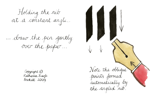
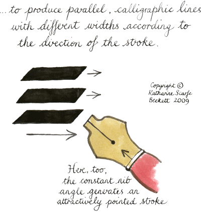
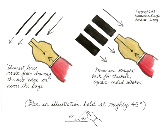
When those skills are separate in your head and (more importantly) in your hand, you’ve mastered the basics of how to write calligraphy. That’s the essential simplicity of it.
So now you've grasped the basic principles of Western calligraphic writing (at least as I understand them!) you may be wondering what is next?
Just as in skiing or learning a foreign language or memorising a routine ... next is PRACTICE. Ask any calligrapher!
(If you're wondering how to write calligraphy with different sorts of tools such as felt-pens, square brushes etc, you might like the 'Five Options' calligraphy tutorial.If you're looking for a quick-and-easy calligraphic effect or you've hit a wall in your calligraphy practice, you might want to have a look at the page on 'easy' calligraphy.)
Just out of interest, the reason why calligraphy pens have a broad, flat nib is because the earliest Western pens were made out of reeds or feathers which were only strong enough to be used for writing if they were not sharpened to a thin point. (In the Far East the problem was solved by making special brushes to paint the letters with. The Arabic-speaking world uses thick-and-thin nibs made of reeds which are cut differently from ours.)
The thick-and-thin effect and small decorative tags or serifs which were created by our early nibs became the standard appearance for good writing. They can still be seen in traditional typefaces or fonts such as Times New Roman. More ‘modern’ fonts such as Arial (and most other internet-friendly typefaces) have removed the thick-and-thin effect and the serifs. Such fonts are called ‘sans-serif’ ('without serifs') for that reason. They are easier to read than traditional letters on a glowing screen – but they look bland, impersonal and utilitarian on paper.
Return from 'how to write calligraphy' to 'calligraphy skills' homepage