Celtic knotwork art techniques: INKING IN
(If you haven't yet seen the first Celtic knotwork art techniques page in this series, you might like to start there.)
O.K. – remember where we'd got to on the last page?
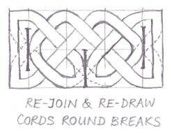
Your design is laid out; now it’s a question of using some simple but precise techniques for inking in the background.
Knotwork art is both strong and delicate. You’ll probably need a thick pen for filling in and a thin one for outlining.
Precision of line is important. It helps to pay attention to the edges of the shapes you’re filling in and how they relate to the cords. These negative 'cut-outs' in the background define the overall look and feel of the knotwork, so they should be exact and regular:
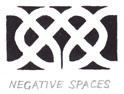
At the same time, if you pay too much attention to the negative spaces alone, it’s easy to for the cord thickness to wander and the curves to start kinking. Celtic knotwork art is about balancing opposites. Try to stay evenly focused between the black background shapes and the white cords to keep them smooth. Watch out at the crossing points in particular. Things can skew easily there.
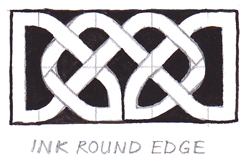
At the same time that you’re filling your Celtic knotwork art with ink or colour, why not put a thin border all the way round to link up the edge pieces? This helps to make the knotwork look whole and complete.
Once you’ve inked in all the way round, you should have something like this:
Now, ink carefully along all the lines marking the crossing-points of the cords. Be careful not to let these outlines intrude on the width of the upper cord. Any Celtic art technique must first of all preserve cord smoothness and cord width.
So the black line showing where cords cross should run along the outer edge of the cord that appears to be on top. In other words, this cord-edge-line intrudes, if at all, into the space of the lower cord – the one that appears to go underneath:
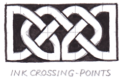
You’ve now created an example of Celtic knotwork art.
For a final finishing touch, give the piece an illusion of three-dimensionality. This is not really so much about how to draw Celtic knots as how to decorate them ... still, it’s worth that bit of extra time.
Go round each crossing point and add a little shading at the edge of the cord which goes under. I've used ink wash, but you could also use hatching or dot shading (with the thin pen):
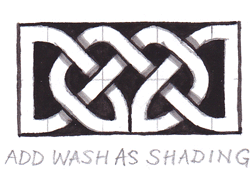
It’s fiddly and it’s very easy to miss an edge. It may help to remember that there are always two edges to shade at every crossing-point. (Even on some of the original Celtic knotwork art, you can find places where a monk forgot some detail on a couple of lines, so don’t worry too much.)
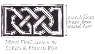
Once the shading's done, re-emphasise the shape of the cords. You can do this by drawing a thin line just inside each edge of the cord all the way round (see below). In the old manuscripts, the resulting central stripe is usually coloured in. The interruption of the coloured stripe by the white edge of the next overlapping cord makes the eye believe even more in the illusion of the over-and-under knot structure.
Also, if you like, add another thin line around the frame
Rub out any remaining pencil lines ...
And here’s your finished result!
Congratulations! You now know the essentials of one method of constructing Celtic knotwork, and you should be able to look at any Celtic knot with a fair understanding of how it might have been put together.
I invite you to play with different widths of panel, numbers of units and positions of breaks so you get a feel for how to manipulate the rules to create your own Celtic knotwork art.
Most importantly, as always ... have fun :-)
Go back to Part 4 of Celtic knotwork design: BREAKS MAKE PATTERNS
Return from 'Celtic knotwork art techniques' to Calligraphy Skills homepage