How to hold a pen (aka 'grips for scripts')
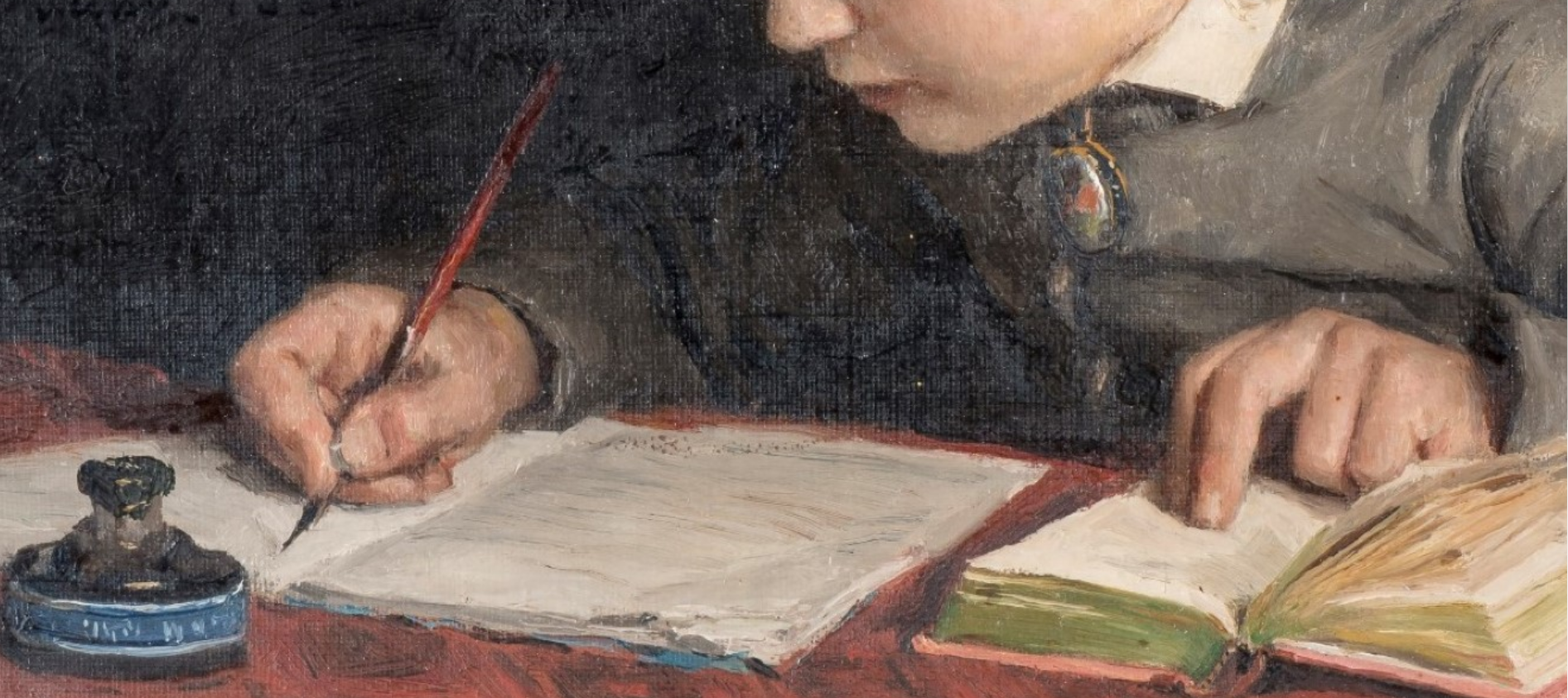
How you hold a pen decides what the trace of its movement will look like. Therefore, a calligrapher concerned with the appearance of her writing is certainly going to consider pen-hold right along with what tools and materials and alphabet to use.
How you hold a pen also determines much about your handwriting in general, including how comfortable, speedy and legible it is.
Many writing-masters in the past have recommended particular holds on the pen and berated students who tried to bend their index finger or use their ring-finger to support the quill. Standard grip, then as now, was thought vital for the formation of a good hand.
Still, historical paintings, diagrams and descriptions also suggest that broad-cut quills and flexible, pointed steel nibs were held differently, and perhaps that different scripts correspond with different grips.
I have looked at a lot of pictures over the past couple of years, trying to figure out whether there is anything to be learned by historical representations of pen-holds.
Allowing for the fact that some paintings and many photos are artificially posed or positioned to make things look good, there still seems to be a basic overall pattern in how people are shown holding their pens over time.
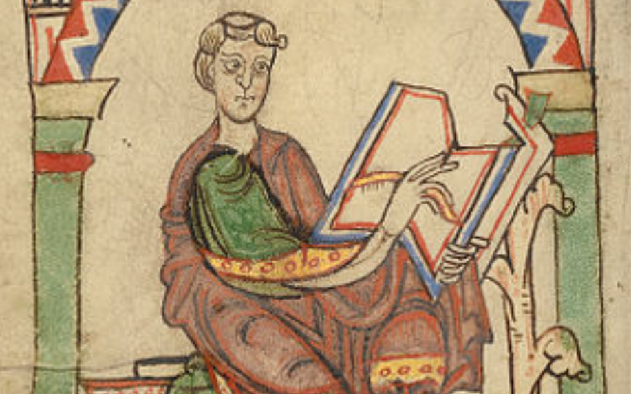
It seems to me that, in general, the further back you go and the less joined-up the handwriting was at the time (gothic, Carolingian minuscule, insular minuscule, uncials, etc), the more likely you are to find illustrations of the following two-fingers-together-and-a-thumb grip:


The first two fingers run straight along the pen and the thumb opposes
to support and guide the pen from the other side. The pen runs up parallel with the first finger, leaving the hand at the index knuckle. The pen is thus presented as an extension of the index finger – even of the arm. The word is the deed!
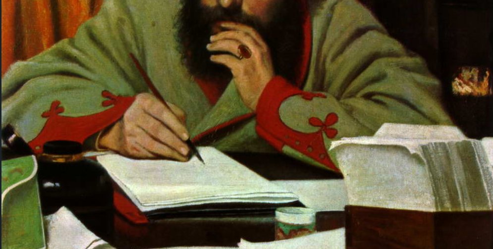
How much of this reflects real writing practice, and how much is symbolism, gratuitous gracefulness, wishful thinking, or just artists finding fingers difficult to draw?
Seeing one's quill turn into a banana-worm is enough to make anyone lose their grip.
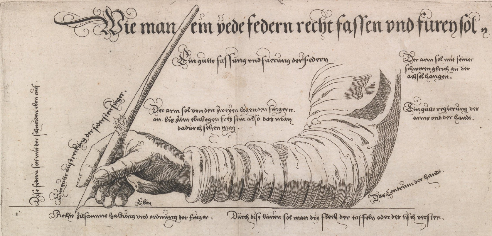
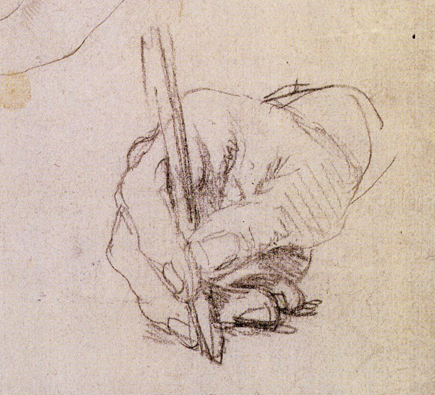
As you come forward in time, or into more cursive hands (running italic, anglicana, secretary, English Roundhand, copperplate-style scrips) – ie into and beyond the seventeenth century – it seems to me that a more tripod-like grip becomes predominant in the art and illustrations of the time. Very often, the quill or pen is shown in a position rather between the first and second fingers, as in this sketch of the hand of Erasmus by Holbein (early 16th century):
Many other paintings show pen-holds identical with a standard grip taught in schools today:
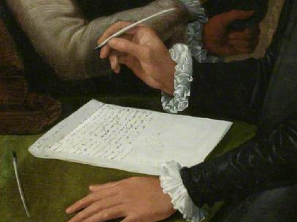
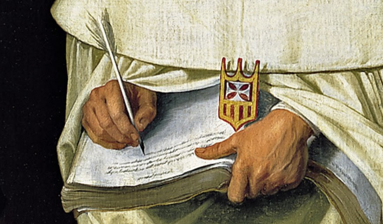
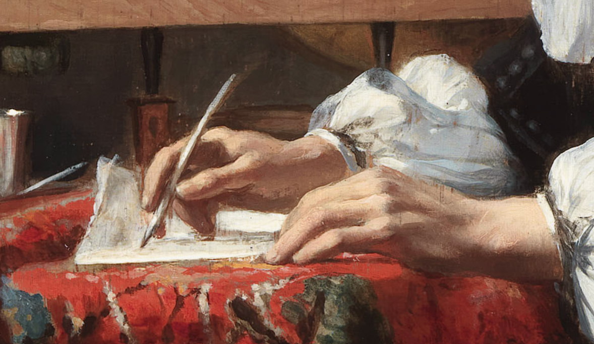
However, in some examples from the seventeenth century on, and increasingly in later nineteenth-century images, a new hand position seems to emerge, in addition to the more 'tripod-like' finger-hold on the pen.
Instead of the hand being held in a relaxed curve on its side, as for italic or today's joined-up handwriting, in some of the historical examples the hand seems to be held with the inner side of the wrist facing downwards, which causes the point of the pen to turn towards the right. Sometimes the paper, too, is angled so the pen is pointed even more sharply to the right.
Notice, also, in these examples, that although the first two fingers are held fairly parallel, the pen protrudes a little in front of the second finger, being held somewhat between index and second, with the thumb underneath:
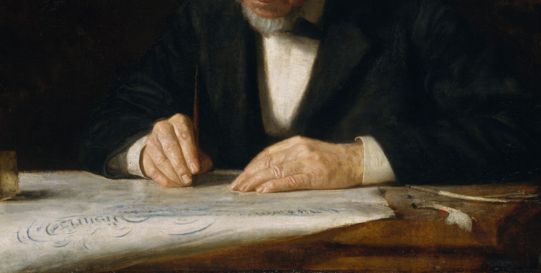
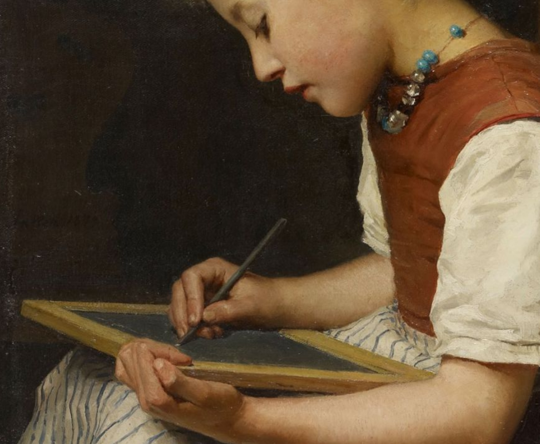
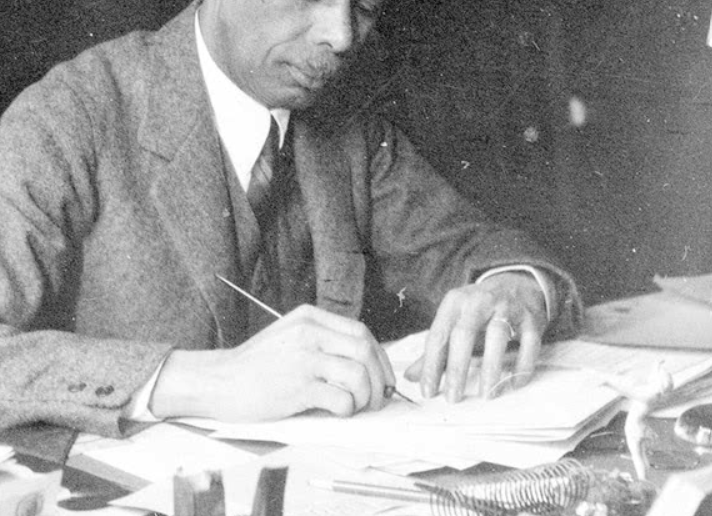
This arm position would certainly make sense for any script relying on pressure to produce thicks and thins – having the pen pointing to the right is what makes it possible to write in a copperplate style. It is also simple to accomplish. If you are right-handed, pick up the pen in a standard tripod grip with your arm pointing up the page ('north'), then just twist the wrist anti-clockwise till it faces down. The pen flips across from left-pointing to right-pointing.
(This also works, by the way, for left-handers handling a standard, right-handed, broad-edged pen, if you can get used to it.)
Finally, throughout history, it seems that a few graceful individuals (or their artists) chose to hold the pen with only the first finger and thumb. While this would make for lightness of touch, flexibility, and freedom of movement, it also requires considerable fine motor control!
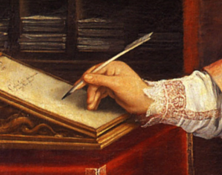
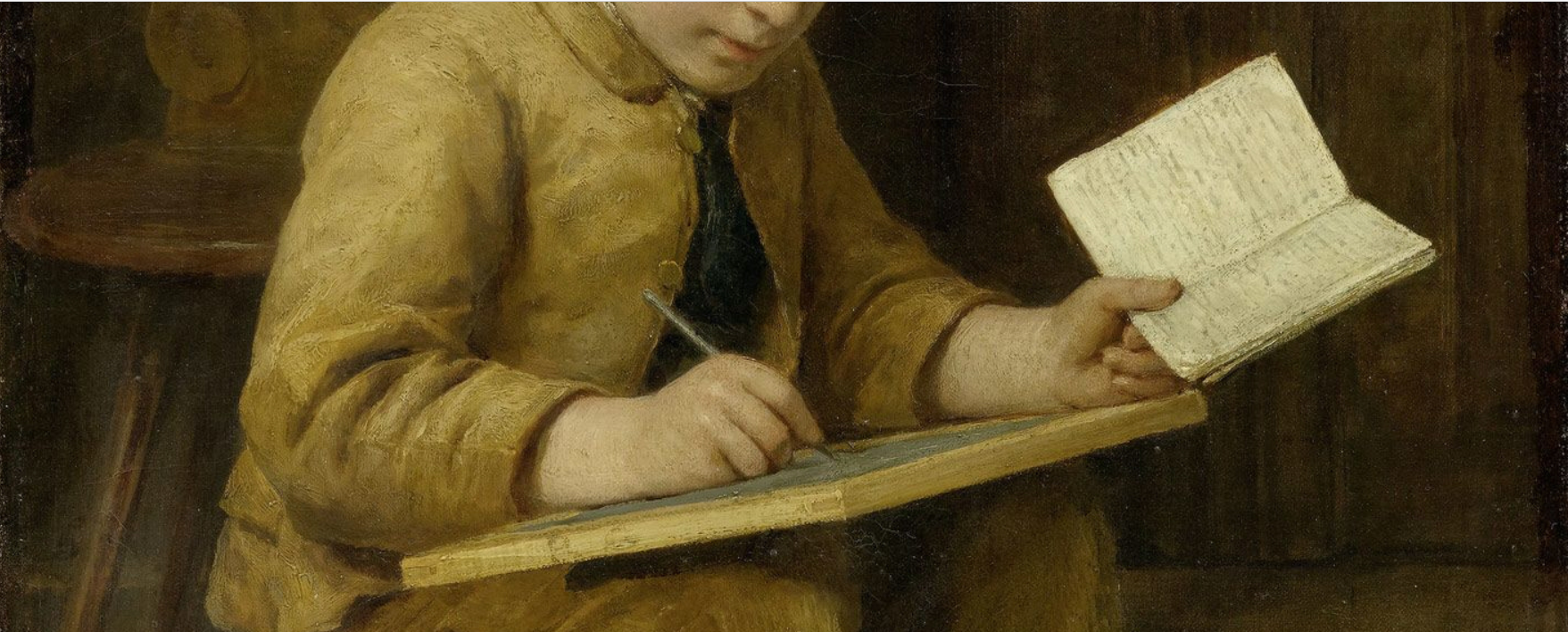
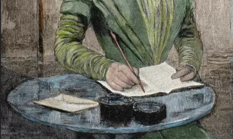
It makes sense that pen-holds tend to adapt, as tools, scripts, and teaching change, and also according to the comfort and preference of the individual. Certainly, more pen-holds exist than most people imagine. In my handwriting teaching, I now very often see a very tight, wrap-around grip quite near the point or nib, which holds the pen nearly upright and controls it very closely. Maybe the dynamic tripod doesn't work so well to control a hard pencil or ball-point pen skidding around on smooth, slippery paper.
I've found it exciting to change my pen-hold and find that my handwriting changes with it – and to discover that, possibly, historical scripts each have their own grip.
Italic works better for me with two fingers parallel along the nib and the hand on its side, the pen facing more or less north-west. A very easy finger-movement then produces slanting, slightly curved lines that lend themselves to italic letter-forms.
Roundhand seems to work best with the hand pointing quite steeply up the page, approximately north-north-west, and the first two fingers parallel as in italic, so the pen rotates easily in the fingers for hairlines and round turns.
Copperplate styles work better – again, for me – with the pen tucked under the first finger and along the nail of the second finger with the other two fingers curled firmly under and the wrist turned down so the pen faces north-north-east. A combination of hand weight and movement in wrist and finger then produces thick-and-thin lines.
For some people, to change their pen-hold seems nearly impossible.
Others can more easily adapt to new grips.
How do you hold your pen?
Did you know the different options?
Which grip is best for which script?