Gothic Alphabet – Step by Step
These Gothic alphabet tutorial pages are my online effort to give you a one-to-one lesson in how to write a particular form of Gothic lettering.
Note: I don't teach the letters in alphabetical order. It's easier and quicker to start with the simpler forms and move on to the more complicated. That way, you are always building on what you've already mastered.
This page starts you off with: i l n u c e.
The second page covers: m w r t h b f k o q p v.
After that,
the third page shows you the rest: d g z x j y a s.
And on another page are sample capital gothic letters A-Z.
You might also enjoy looking through this page on how to make your own Gothic greetings card using similar lettering and some decorative doodling.
There are loads of illustrations of how to write a Gothic alphabet step by step in the lessons themselves. But to start with, here's a rough idea of what this form of Gothic looks like:

The above is not a particularly good or beautiful example, but it gives you an idea.
If you do the whole tutorial thoroughly, there are at least a couple of hours’ fun to be had out of it. By the end, you should, I hope, know more about writing Gothic than when you started.
Let’s roll up our sleeves ...
Gothic 'littera textualis quadrata'
The particular style of Gothic alphabet I’ve laid out here is a formal hand that would have been used for copying the main text (ie not translations or footnotes) of high-quality books in Latin between 1200 and 1500. Its Sunday title is littera textualis quadrata. The ‘littera textualis’ means it’s letters for the main text (ie high-grade formal writing)-- and ‘quadrata’ refers to the square, regular, ‘four-sided’ look of it. This is the second-highest grade of Gothic alphabet from the period. (Even more prestigious was textualis prescissa or sine pedibus.)
In case you want to know, it’s pronounced ‘LIT-era tex-choo-WAH-lis kwod-RAH-tuh’.
You will need ...
First, set up your workspace and materials comfortably. Check that you have:
1. A clear desk-space (preferably on a sloping writing-desk, or a desk-easel. You could use a board propped against a dictionary.)
2. Fair quality paper (preferably lightly ruled).
3. Broad-nibbed pen and ink.
4. Tissues or cloth, and water if you like, for wiping ink off the nib, fingers, etc.
Strictly, you should be lined up squarely in front of the desk with all your materials in easy reach, feet flat on the floor, back straight and shoulders relaxed. And, of course, this page in clear sight. I’m going to assume you’ve made yourself comfortable :-)
Gothic alphabet easy measurements
The wider your nib, the taller and larger your letters must be. You should write your Gothic alphabet at a size which is in proportion to the thickness of your nib so that it shows a pleasing balance of black and white space. Rule your top line accordingly, or just estimate and stick to it as well as you can.
Gothic alphabets can vary in density and spacing. A standard, fairly open version is written around 4.5 nib-widths high for the x-height (the height of the regular small letters such as x, e, c, a, o.) Allow another 2-2.5 nib-widths above the x-height and below the base-line for ascenders or descenders on letters such as b, h, g, p. There are a couple of letters – d and t – that are in between 4.5 and 7 nib-widths high.
Here's an illustration of what 4 nib-widths looks like if your nib is very thick (your own nibwidths and, therefore, your Gothic alphabet may well be smaller or larger):

Alternatively, if you have good eyesight and a very small ruler, you can measure your nib’s width in tenths of a millimeter and simply multiply by 4.5 and 7. (Joke.)
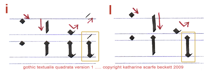
Once you’re happy that you know roughly how tall the letters of your Gothic alphabet should be, it’s best to start with the two simplest: ‘i’ and ‘l’.
(Aside: here’s how I’ve laid out these tutorial pictures:

The top line of the illustration, going from left to right, is where I show – separately, in sequence – each mark you need to be able to make in order to form a particular letter of this Gothic alphabet.
Then, underneath, in the bottom line of the illustration, you’ll see how the letter progresses as a whole when you add the different marks together. The final letterform is outlined in a gold box.)
So make sure you’re holding your pen relaxedly, at 45 degrees, and let's begin:

You will notice (I hope!) that a Gothic letter ‘i’ is made up essentially of three marks: a symmetrical lozenge at the top, a short vertical (a ‘minim’) and another symmetrical lozenge at the bottom, which has an optional small upwards tick on it if it’s the final letter in a word.
(The thin diagonal slash as a ‘dot’ above the ‘i’ is not always found in the medieval originals but is very useful indeed for making Gothic script more legible.)
The Gothic letter ‘l’ is exactly the same, but the first lozenge starts about 7 nib-widths up and the descending vertical is of course longer (and more prone to wobble).
Watch out for muscular tension and poor posture. It will make your letters stiff and clumsy. Relax your arm, straighten your back, loosen your grip (no white knuckles please), keep the nib light upon the page and try to move your whole hand and wrist to form the letters. (HANDwriting, not ‘finger-writing’.)
It’s best to do each letter a few times, trying to improve it a little each time.
There are not many practice words containing only the letters ‘i’ and ‘l’ but, still, I recommend that you write out the following. Try to keep the letters regular:
li ill illi lili
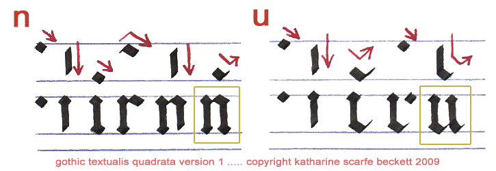
Okay. Enough lilili? On to the next Gothic letters: ‘n’ and ‘u’. These are basically formed of two ‘i’s joined together and the join is … an exciting diagonal line!
Feeling excited? ;-D
The trick with ‘n’ and ‘u’ (and, later, ‘m’ and ‘w’) is to make sure that the joining diagonals at the top (‘n’) or bottom (‘u’) are only a tiny bit longer than the lozenge you start the ‘i’ with. The diagonal shoulder should create just enough white space inside the letter to balance the black – between 1.5 and 2 nibwidths’ worth of white space, that’s all.

Yes, it really does take six separate pen-strokes to form this sort of Gothic letter ‘n’. (Wait till you try ‘m’.) That is why, among Gothic alphabets, textualis quadrata was used for high-quality copying, not for scrawling shopping lists. But it gets quicker with practice. And there really is no way to create the elaborate look of a Gothic alphabet other than by labouring a little.
Labour a little more over these practice words. If you line up your lozenges nicely, they will look terrific:
nun lull nil null inn lulu
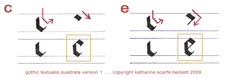
All right. Now, a pair of less complex Gothic letters – these are only two pen-movements each. You must change direction cleanly partway through each stroke to create a new straight line – no curves.
And there is a little trick to these two letters: at the top left of each, you will join up the pointed ends of your lines to form a straight diagonal edge, two nib-widths wide. Again, it’s easier to show you than to explain:

You see? You start the first vertical a little below what will be the final height of the letter. Make sure your nib is angled at 45 degrees. Then draw straight downwards. Before you get to the bottom, angle diagonally right, still drawing downwards. At the bottom of the letter, change nib direction to move diagonally right and upwards to make a short, thin ‘tail’.
Then take the nib off the paper, and reposition it at the top of the letter again so that the nib’s left corner just touches the vertical line’s top right corner. Keep the pen angle at a constant 45 degrees. Draw a slightly down-sloping bar across to the right. The 45-degree corners of the lines have meanwhile mysteriously met up to create a tidy, squared-off ‘c’ or ‘e’. Neat, eh?
You’ll use the same trick to form other Gothic letters later on. But meanwhile, here are some more interesting words to practise with:
ecu ice eel nice clue lice cull uncle icicle
‘Icicle’ is such a lovely-looking word that it’s well worth writing it out again for the sheer pleasure of watching it form. (Take that as a hint if you like!)

This lesson continues in Part 2 with a longer section of the alphabet: m w r t h b f k o q p v. Click the link below to carry on. (Or have a cup of tea first. You've earned it.)
Continue to Part 2 of the gothic tutorial
Continue to Part 3 of the gothic tutorial
Go to CAPITAL gothic letters A-Z
Return from 'Gothic Alphabet Step by Step' to homepage